Client: Mr. Seyed Reza Hosseini
project title : Logo design Resaneh Bartar company
Year of project: 2020
Description: Bartar Media Company is a cultural and social newspaper, and its logo design was more readable because it was addressed to all sections of society. Simplicity played an important role in the design.
Client: Mr. Seyed Reza Hoseini
project title : Logo design Anil printing and packaging
Year of project: 2019
Description: Anil Company is a printing house in the field of printing and packaging of products in which the visual vision of the logo is the first priority.And in the new logo of this company, red color has been used for more attractiveness.
Client: Mr. Amin Dolatkhah
project title : Logo design Kafshdozak design and printing center
Year of project: 2020
Description: The logo is for the printing house and the printing center, and the same form and pattern is used between the letters, which has a quick visual view for all audiences.
Client: Mr. Omid Yavari
project title : Sangvareh company logo design
Year of project: 2017
Description: In the logo of this company, turquoise color, which is the traditional color of Iran, is used with a neutral color obtained from mineral soil.
Client: Mr. Mohammad Sedighi
project title : Sang Kave Renan logo design
Year of project: 2016-2017
Description: Sang Kave Renan Company is active in the field of exporting and importing stones in the form of slabs and cubes. In designing this logo, a cube of stone was used and I designed the first letters of the company name in the form of a cube.
Client: Mrs. Ahmadi
project title : Combination of letters ( خ و ن )
Year of project: 2014
Description: Logo is an exercise in typography of letters designed in the form of a geometric shape.
Client: Mr. Davari
project title : Logo design of calligraphy center
Year of project: 2013
Description: The calligraphic logo was used for the calligraphy institute because of the smooth design and soft lines, and because the audience of this institute was of all ages, cold and warm colors were used in the logo.
Client: Mrs. Ahmadi
project title : Javan magazine logo design
Year of project: 2013
Description: The javan logo was for a specialized magazine for teenagers and young people, and because of its audience, cheerful colors such as red and orange were used.
Client: Saba Mihan Industrial, Mining and International Company
project title : logo
Year of project: 2014
Description: Saba Mihan Company is an international industrial, mining and company, and in this logo, the mountain icon is used to show the mine and a map for the international activity of the company.
Client: Tara Trading International Trading Company
project title : logo
Year of project: 2014
Description: Tara Tejarat Company is a company with international activities. In designing this logo, a four-sided pyramid mode is used, which represents the international activity of the company.
Client: Mr. Mahmoud Azari
project title : Combination of Latin written logo and visual logo
Year of project: 2015 - 2016
Description: TRCP brand in the initial implementation of the logo, the first letters of Tire Recycle-Crumb Production are used and in visual elements and designs, rubber texture is used in the design. In this logo, orange color is used, which is a symbol of strength, success, encouragement.
Client: Mr. Alireza Sohankar
project title : Combining text logo and logo
Year of project: 2014
Description: Mr. Sohankar is in charge of managing a construction and architecture company. In this logo, due to the job of the customer, the simplified symbol of the building and the color green are used, where the text and the image are combined.
Client: Zafar Construction Company
project title : Combining text logo and logo
Year of project: 2014
Description: Zafar Company is a mass-produced construction company that uses the symbol of towers and tall buildings in this design, and the crimson color was approved due to its organizational nature.
Client: Zafar Construction Company
project title : Combining text logo and logo
Year of project: 2014
Description: Zafar Company is a mass-produced construction company that uses the symbol of towers and tall buildings in this design, and the crimson color was approved due to its organizational nature. This logo was one of the designs that another design was published.
Client: Anil Resaneh Bartar Company
project title : Latin written logo
Year of project: 2014
Description: Anil Company is a printing house and operates in the field of product packaging. In this logo, the visual vision of the logo was the first priority, and due to the international activities of the company and the mark of Iranian origin, I used turquoise, which is the symbol of Iran.
Client: Anil Resaneh Bartar Company
project title : Persian text logo
Year of project: 2014
Description: Anil Company is a printing house and operates in the field of product packaging. In this logo, the visual vision of the logo had the first priority and the curved lines used in the Latin logo of this company were repeated in the Persian logo and in this logo, blue and orange color contrast was suggested Finally, the turquoise rank was confirmed.
Client: Anil Resaneh Bartar Company
project title : Latin written logo
Year of project: 2014
Description: Anil Company is a printing house and operates in the field of product packaging. In this logo, the visual vision of the logo was the first priority, and due to the international activities of the company and the logo of Iranian origin, I used turquoise, which is the symbol of Iran. This logo was one of the designs that another design was published.
Client: Isfahan Resaneh Bartar Newspaper Company
project title : Written logo
Year of project: 2014
Description: Resaneh Bartar Company is a cultural and social newspaper. The logo is designed from an interconnected pixel line and dot structure, and a neutral gray tone is used, which in any environment and any newspaper layout, the logo is in harmony with the rest of the structures.
Client: Aref Car Exhibition and Gallery
project title : Written logo
Year of project: 2014
Description: Aref is a car import gallery that tries to use curved and Iranian lines in the structure of the logo, and readability for all segments of the people has been a priority for the customer.
Client: Aref Car Exhibition and Gallery
project title : Written logo
Year of project: 2014
Description: Aref is a car import gallery that tries to use curved and Iranian lines in the structure of the logo, and readability for all segments of the people has been a priority for the customer. This logo was one of the designs that another design was published.
Client: Bahman Paper Manufacturing Company
project title : Written logo
Year of project: 2014
Description: Bahman Company is a paper production company that in addition to considering the ease of reading this Loko, green color is used because the main material of paper production is from nature and the color is consistent with the company's performance.
Client: Bahman Paper Manufacturing Company
project title : Written logo
Year of project: 2014
Description: Bahman Company is a company that produces all kinds of paper. In this logo, the shape of a tree trunk is used. The logo is cut and the red color was suggested at the beginning of the work. This logo was one of the designs that another design was published.
Client: Dr. Mahmood Jamali
project title : Design of office set of ARG REAL ESTATE
Year of project: 2020
Description: In designing the office set, I used the two colors in the logo and used the geometric form to make the design more special.
Client: Dr. Mahmood Jamali
project title : Design of office set of ARG REAL ESTATE
Year of project: 2020
Description: In designing the office set, I used the two colors in the logo and used the geometric form to make the design more special.
Client: Dr. Mahmood Jamali
project title : Design of office set of ARG REAL ESTATE
Year of project: 2020
Description: In designing the office set, I used the two colors in the logo and used the geometric form to make the design more special.
Client: Dr. Mahmood Jamali
project title : Design of office set of ARG REAL ESTATE
Year of project: 2020
Description: In designing the office set, I used the two colors in the logo and used the geometric form to make the design more special.
Client: Mr. Bahram Ahmadrezayi
project title : Design of office set of ROYAL REAL ESTATE
Year of project: 2020
Description: In this office set, according to the customer's request, a simplified form has been used, which I have done by using with the colors inside the logo. Green is due to construction and development.
Client: Mr. Farhad Mohamadi
project title : Design of office set of ADVANCE INTERNATIONAL GENERAL TRADING
Year of project: 2018
Description: In this collection, simple and expressive design plays the first role and has made this simplicity unique only with small colors and visual elements.
Client: Mr. Omid Yavari
project title : Design of office set of Sangvareh company
Year of project: 2017
Description: In the office set of this company, turquoise color, which is the traditional color of Iran, has been used with a neutral color obtained from mineral soil. The cut of the business card is special and different and is inspired by the shape of natural stones.
Client: Mr. Morteza Davari
project title : Design of office set of Tara Stone factory
Year of project: 2020
Description: Tara Sang is active in the field of export and import of natural stone, which was one of the proposed designs in which the gray color derived from natural stone and gold was used to be a classic.
Client: Mr. Morteza Davari
project title : Design of office set of Tara Stone factory
Year of project: 2020
Description: Tara Sang is active in the field of export and import of natural stone. In designing their office set, stone texture and vein have been used, which shows the company's activity at first sight.
Client: Mr. Omid Yavari
project title : Design of office set of Sangvareh company
Year of project: 2017
Description: In the invoice collection of this company, turquoise color, which is the traditional color of Iran, has been used with a neutral color obtained from mineral soil.
Client: Mr. Omid Yavari
project title : Design of office set of Sangvareh company
Year of project: 2017
Description: In the office set of this company, turquoise color, which is the traditional color of Iran, has been used with a neutral color obtained from mineral soil. The cut of the business card is special and different and is inspired by the shape of natural stones.
Client: Mr. Mohammad Sedighi
project title : Design of office set of Tara Stone factory
Year of project: 2017
Description: In designing the office set, their broken logo form was used for a special cut of the business card, and the colors used in it are the organizational color of the logo.
Client: Sangvareh Company
project title : Cut card business design (cut is taken from the shape of a stone)
Year of project: 2017
Client: Elixir Furniture Company
project title : designing the business card
Year of project: 2020
Client: Boomerang Marketing Company
project title : designing the business card
Year of project: 2020
Client: Mr. Mohsen Abbasi
project title : Narenj fast food business card design
Year of project: 2019
Client: Andisheh Mehtaran Pars Scientific and Research Company
project title : Cut card business design
Year of project: 2018
Client: Tire recycling company and rubber powder production
project title : Office set design including business card, letterhead, envelope, note paper
Year of project: 2015-2016
Description: TRCP brand in the initial implementation of the logo is taken from the first letters of the text Tire Recycle-Crumb Production, which is used in the design of visual elements of the rubber texture.
Client: Chehelston International Trading Company
project title : Persian and Latin bilingual business card design
Year of project: 2019-2020
Description: Chehelseton Company is an international company for import and export of consumer goods. The name of the company is taken from the historical mansion of Isfahan, which is several hundred years old, to show the greatness and authority of the company. In this regard, I used Iranian painting lines in the logo. And in designing office forms, I combined yellow for the symbol of industrial and commercial activity and turquoise blue to maintain the originality of being Iranian.
Client: Chehelston International Trading Company
project title : Persian and Latin bilingual business card design
Year of project: 2019-2020
Description: Chehelseton Company is an international company for import and export of consumer goods. The name of the company is taken from the historical mansion of Isfahan, which is several hundred years old, to show the greatness and authority of the company. In this regard, I used Iranian painting lines in the logo. And in designing office forms, the contrasting colors of blue and orange were the demands of the employer, which was not approved.
Client: Chehelston International Trading Company
project title : Office set design (business card, letterhead, envelope)
Year of project: 2019-2020
Description: Chehelseton Company is an international company for import and export of consumer goods. The name of the company is taken from the historical mansion of Isfahan, which is several hundred years old, to show the greatness and authority of the company. In this regard, I used Iranian painting lines in the logo. And in designing office forms, I combined yellow for the symbol of industrial and commercial activity and turquoise blue to maintain the originality of being Iranian.
Client: Mr. Engineer Hosseini
project title : Design of office paper set including letterhead, envelope, business card, note sheet and promotional gifts
Year of project: 2014
Description: The design of Anil printing house office set, due to the ease of visual vision, simple lines and beautiful layout were used for the design, and the choice of red color was due to the attractiveness in the eyes of the audience.
Client: Isfahan Resaneh Bartar Newspaper Company
project title : New text logo and office set design (business card, letterhead, envelope)
Year of project: 2019-2020
Description: Resaneh Bartar Company is a cultural and social newspaper that the employer decided to register a new and more readable logo after a few years. In this new set, purple color was used for more attractiveness and dramatic design forms taken from nature and leaves. To show the vitality and vitality of the company with more charm.
Client: Golsa Cosmetics Import Company
project title : Office set design (business card, letterhead, envelope)
Year of project: 2014
Description: Golsa company is active in the field of importing cosmetic products. In the office set of this company, curved forms taken from human skin texture were used and I used purple color for the softness of the products that are related to women.
Client: Mr. Majidreza Savoj
project title : Designing the catalog of Miad Beton Sepahan Company
Year of project: 2020
Description: Miad Beton Sepahan Company is an industrial company that works in the field of cement, and in designing this brochure, cement texture has been used for the field, which has a fast and clear visual view for the general customers of this company.
Client: Mr. Ganji
project title : Catalog design of Ganji Mosaic Factory
Year of project: 2019
Description: The order of this catalog is by the customer to introduce all the products of the factory, which uses the simple and linear role of mosaics for design.
Client: Mr. Ganji
project title : Catalog design of Ganji Mosaic Factory
Year of project: 2019
Description: The order of this catalog is by the customer to introduce all the products of the factory, which uses the simple and linear role of mosaics for design.
Client: Mr. Ganji
project title : Catalog design of Ganji Mosaic Factory
Year of project: 2019
Description: The order of this catalog is by the customer to introduce all the products of the factory, which uses the simple and linear role of mosaics for design.
Client: Ms. Mahin Naghavi
project title : Designing the catalog of Andisheh Mehtaran Pars Scientific and Research Company
Year of project: 2020
Description: Andisheh Mehtaran Pars Company is a scientific and research company that has used Islamic shapes to design its catalog, because these shapes create comfort for a patient and both yellow and red colors are taken from traditional Iranian colors.
Client: Ms. Sophia Hokm Abadi
project title : Magazine Design Negah Aval
Year of project: 2016
Description: Design for a specialized graphic magazine.
Client: Dr. Shahram Javadinejad
project title : Book cover design for Book Day
Year of project: 2018
Description: On the occasion of Book and Book Reading Day, Golsa Company has considered a book as a gift, the design of the cover of which I designed with the company logo, and the image of the book and the Islamic role have been used.
Client: Mahan Stone Import and Export Company
project title : catalog design
Year of project: 2019
Description: Mahan Company is a company that imports and exports building stones. This design was a catalog and layout of text and images to display the products and introduce the company in the Italian International Stone Exhibition.
Client: Narenj fast food
project title : Brochure and menu design
Year of project: 2016
Description: Narenj Fast Food is an Italian fast food that uses linear forms of food and a combination of slogans and linear images in its design.
Client: Zoom Photography Magazine with the management of Ms. Mahtab Ghorbaniyan
project title : magazine cover design
Year of project: 2016
Description: Zoom Magazine is a specialized magazine in the field of photography, which was active in the field of women's photography, and in its graphic design, a detail of a woman's body was photographed and executed.
Client: Renan Stone Industrial and Mining Company
project title : catalog design
Year of project: 2016
Description: Sang Saz Company is an industrial and mining company with international activities. The design of this catalog is to introduce all products, including stone cutting, cutting, sawing and stone resin. This catalog was designed in Latin to participate in foreign exhibitions.
Client: Renan Stone Industrial and Mining Company
project title : Three-leaf brochure design
Year of project: 2016
Description: Sangsaz Company is an industrial and mining company with international activities. The design of this brochure is to introduce luxury construction products and accessories. This brochure was designed in Latin to participate in foreign exhibitions.
Client: Espadana Plastic and Laser Skin Surgery Center
project title : Catalog cover design
Year of project: 2014
Description: Espadana Center is a cosmetic and surgical institute that uses circular shapes, laser and microscopic textures in its design.
Client: Andisheh Mehtaran Pars Scientific and Research Company
project title : Design a government brochure with a special cut
Year of project: 2014
Description: Mehtaran Company is active in the fields of science, research and psychology. The design of this brochure is to introduce their services. And the cut edge of the brochure is taken from the curved lines inside the logo.
Festival title : Why the "Graphic Design Festival" Physically Far - social connection
Year of project: 2020
Description: Selected in the list of international posters "Physical-Social Communication" Contest in the fourth WHY graphic design Festival - My poster was one of the 20 selected Works from 250 works from around the world.
Festival title : Malaysia Prihatin (merdeka expression - COVID 19) Malaysian Priatin
Year of project: 2020
Description: My selected works in the virtual exhibition of Malaysian visual arts educators about the celebration of Malaysia Independence Day
Festival title : Malaysia Prihatin (merdeka expression - COVID 19) Malaysian Priatin
Year of project: 2020
Description: My selected works in the virtual exhibition of Malaysian visual arts educators about the celebration of Malaysia Independence Day
Client: Resaneh Bartar company
project title : Poster design (environmental graphics)
Year of project: 2020
Description: Resaneh Bartar Company is a cultural and social newspaper. The design of this poster is to introduce the company and their logo was used as a typographic poster, because readability and fast view were the main points of this project.
Client: Resaneh Bartar company
project title : Poster design (environmental graphics)
Year of project: 2019-2020
Description: To design this poster, because it was in public view, more focus was placed on the company logo and textual information, and attention-grabbing colors were used, because this poster had a public aspect and legibility was observed at first sight.
Client: Arshia Food Company
project title : Poster design
Year of project: 2016
Description: This poster is to show the olive honey product and to show the properties of this product for the body, the heart symbol has been used, which contains olives and honey obtained from it.
Client: Arshia Food Company
project title : Poster design
Year of project: 2016
Description: This poster is to show the olive honey product and to show the properties of this product for the body, the heart symbol has been used, which contains olives and honey obtained from it.
Client: Resaneh Bartar company
project title : Poster design (environmental graphics)
Year of project: 2019-2020
Description: To design this poster, because it was in public view, more focus was placed on the company logo and textual information, and attention-grabbing colors were used, because this poster had a public aspect and legibility was observed at first sight.
Client: Holding a war poster exhibition at Yazd University of Arts
project title : War (do not kill my innocent child)
Year of project: 2014
Description: This poster is a typography combining the word war in Latin and Persian and uses lines that are taken from the spear in the early wars and the black color is chosen because of the darkness and cruelty of the war.
Client: Holding a war poster exhibition at Yazd University of Arts
project title : War (do not kill my innocent child)
Year of project: 2014
Description: This poster is a typography combining the word war in Latin and Persian, and the large black word and color chosen is due to the darkness and brutality of the war.
Client: Holding a war poster exhibition at Yazd University of Arts
project title : War (do not kill my innocent child)
Year of project: 2014
Description: This poster is a typography combining the word war in Latin and Persian and breaking the target lines to show the violence of war. And the black color is chosen because of the darkness and cruelty of war.
Client: Arpanoosh Company
project title : Graphic poster of Ma'alsheer Istak
Year of project: 2017
Description: This poster was a competition between graphic designers that had a more graphic aspect than the advertising aspect at first glance. In this poster, I used the main base of the apple fruit drink and the basic way of turning fruit into fruit juice, and combined these two options. I showed the product obtained from this process.
Client: Holding an anti-poverty poster exhibition at the Artists' House
project title : poverty line
Year of project: 2019
Description: In this poster, the symbol of man is used, whose heart needs the necessities of life, and the dark color of the symbol of man is chosen for the intensity of his sorrow and need.
Client: Holding a poster exhibition in honor of Swiss graphic designer Ernest Keller
project title : Ernest Keller
Year of project: 2019
Description: The design style of this graphic designer is called Switzerland or the same style of global typography, in which pure mediators and message readability are the most important design factors, and this poster has been executed in typographic form.
Client: Holding a festival and exhibition of typography and calligraphy Salam
project title : Salam
Year of project: 2014
Description: In this poster, curved lines and a mold form have been observed in the whole work and cooked and Islamic colors have been used.
Client: Holding a festival and exhibition of typography and calligraphy Salam
project title : Salam
Year of project: 2014
Description: In this poster, curved and Islamic lines are used and the forms are repeated in the background.
Client: Isfahan Jam Jam Newspaper Company
project title : Resaneh Bartar Poster
Year of project: 2014
Description: This poster is executed in two dimensions and is for informing the company's advertisements.
Client: Mr. Mohammad Sedighi
project title : Design of Sang Kavo Renan site
Year of project: 2017
Description: In designing the site of this company, due to being industrial and mineral, a simple but beautiful pattern has been used, and also the colors used in the logo of this company have been used. One of its design principles is easy access to the latest company information for all contacts.
Client: Sepahan Miad Concrete Company
project title : Initial site design
Year of project: 2020
Description: Miad Beton Sepahan Company is an industrial company that operates in the field of cement and in the design of this site, cement texture has been used that has a clear and fast visual vision for the general customers of this company.
Client: Khorasan safety glass factory in Mashhad
project title : Graphic design of the site
Year of project: 2014
Description: To design this site, a simple template and easy access were considered because their customers could easily place orders on the site. Due to the colorlessness of the glass, two attractive colors, red and black, were used in the design at the request of the customer.
Client: Andisheh Mehtaran Pars Scientific and Research Company
project title : Initial site design
Year of project: 2013-2014
Description: Mehtaran Company is active in the fields of science, research and psychology. The purpose of designing the website is to introduce their services. Due to the people who have mental problems and are the audience of this institute, its design color is based on happy and energetic colors. I chose and also used the forms of nature and birds to convey vitality among the audience.
Client: Resaneh Bartar Sports Club
project title : Web Design
Year of project: 2018
Description: This is a women's sports club and its site design has all the conditions related to women, including happy colors and curved forms.
Client: Anil Resaneh Bartar Company
project title : Initial site design
Year of project: 2014
Description: Anil Company is a printing house and is active in the field of product packaging. Due to the generality of the company's audience, popular forms and colors have been used. This is a basic pre-design.
Client: Basic Lawyer of a Judiciary Dr. Hossein Abbas Alizadeh
project title : Personal site design
Year of project: 2019
Description: In designing this site, original Iranian forms and motifs have been used and the forms have been repeated in all the detail pages.
Client: Anil Resaneh Bartar Company
project title : Initial site design
Year of project: 2014
Description: Anil Company is a printing house and is active in the field of product packaging. Due to the generality of the company's audience, popular forms and colors have been used. This is a basic pre-design.
Client: Anil Resaneh Bartar Company
project title : Initial site design
Year of project: 2014
Description: Anil Company is a printing house and is active in the field of product packaging. Due to the generality of the company's audience, popular forms and colors have been used.
Client: Anil Resaneh Bartar Company
project title : Initial site design
Year of project: 2014
Description: Anil Company is a printing house and is active in the field of product packaging. Due to the generality of the company's audience, popular forms and colors have been used.
Client: Basic Lawyer of a Judiciary Dr. Hossein Abbas Alizadeh
project title : Personal site design
Year of project: 2019
Description: In designing this site, original Iranian forms and motifs have been used and the forms have been repeated in all the detail pages.
Client: PetGet Pet Shop
project title : Mobile application design
Year of project: 2020
Description: This application is designed for buying and selling animals. In the design of this application, it is designed from flat colors and simple layouts with quick access for the user.
Client: Car service and equipment company with WIMA brand
project title : Mobile application design
Year of project: 2019
Description: This application is for buying and selling all kinds of cars and car parts through auctions. In its graphic design, car tire textures and car symbols have been used.
Client: Horton Institute for Beauty and Health
project title : Mobile application design
Year of project: 2018
Description: Horton is a beauty and health institute in the form of club activities and fitness, and because the color blue is more relaxing than other colors, it relieves mental and physical fatigue, and enhances self-confidence and a sense of security in this format. Blue color is used.
Client: Mr. Mohsen Abbasi Naranj Fast Food Manager
project title : Design, supervision and implementation of fast food
Year of project: 2014
Description: The design of this project was done in a modern style and yellow and green colors were used in the decoration and accessories. After analyzing and brainstorming for the desired location, the initial design was executed with 3D software and then this project from the beginning of design to Interior design and delivery to the client was done with the responsibility and supervision of me and the executive team.
Client: Lobby of Mr. Reza Alizadeh Aghdam's house
project title : Lobby design
Year of project: 2014
Description: After analysis and ideation for the desired location, the initial design was implemented with 3D software.
Client: Lobby of Mr. Reza Alizadeh Aghdam's house
project title : Lobby design
Year of project: 2014
Description: After analysis and ideation for the desired location, the initial design was implemented with 3D software.
Client: BMW representative office in Isfahan
project title : Car showroom decoration design
Year of project: 2014
Description: After analysis and ideation for the desired location, the initial design was implemented with 3D software.
Client: BMW representative office in Isfahan
project title : Car showroom decoration design
Year of project: 2014
Description: After analysis and ideation for the desired location, the initial design was implemented with 3D software.
Client: BMW representative office in Isfahan
project title : Car showroom decoration design
Year of project: 2014
Description: After analysis and ideation for the desired location, the initial design was implemented with 3D software.
Client: BMW representative office in Isfahan
project title : Car showroom decoration design
Year of project: 2014
Description: After analysis and ideation for the desired location, the initial design was implemented with 3D software.
Client: Residential house of Mr. Reza Alizadeh Aghdam, basic lawyer of a court of law
project title : Design, supervision and implementation of residential buildings (reconstruction and renovation)
Year of project: 2017-2018
Description: After analysis and idea generation for the desired location, the initial design was executed with 3D software and then this project was done from the beginning of design to interior design and delivery to the client with the responsibility and supervision of me and the executive team. It was performed in a classical style.
project title : Photography of historical monuments
Year of project: 2014
project title : Inanimate object photography (details)
Year of project: 2014
project title : Photography of historical monuments (bazaar)
Year of project: 2014
project title : Inanimate object photography (details)
Year of project: 2014
project title : Nature photography
Year of project: 2014
project title : Nature photography
Year of project: 2014
project title : Nature photography
Year of project: 2014
project title : Nature photography
Year of project: 2014
project title : Inanimate object photography (details)
Year of project: 2014
project title : Inanimate object photography (details)
Year of project: 2014
project title : Nature photography - black and white
Year of project: 2014
project title : Surreal photography
Year of project: 2014
Description: "Surrealism is the spontaneous psychological activity by which the real and real activity of the thinkers can be presented, either orally or in writing, or in any other form." In surrealism, the aim is to bring about a new and absolute reality. In other words, it combines reality and dream to create a "reality superior to reality."
project title : Nature photography - black and white
Year of project: 2014
project title : Nature photography - black and white
Year of project: 2014
project title : Anti-glare or silhouette photography
Year of project: 2014
Description: ضد نور یا سایهنما یا سیلوئیت به فرانسویSilhouette)) It is a technique in photography in which the light source is behind the subject and in the strongest case, due to the intensity of the light, a shadow of the subject is created on the photo. The most beautiful state occurs when the sun is rising or setting and the background is orange or yellow.
project title : Surreal photography
Year of project: 2014
Description: "Surrealism is the spontaneous psychological activity by which the real and real activity of the thinkers can be presented, either orally or in writing, or in any other form." In surrealism, the aim is to bring about a new and absolute reality. In other words, it combines reality and dream to create a "reality superior to reality."
project title : Black and white portrait photography
Year of project: 2014
project title : Advertising photography of food
Year of project: 2014
Description: The purpose of advertising photography is to show the desired product in the best and most attractive way and to persuade the customer to buy it. Promotional photos should be passionate and energetic and convey their message clearly and concisely.
project title : Black and white portrait photography
Year of project: 2014
Client: Ms. Mahin Naghavi
project title : Banner design of self-knowledge and life skills seminar of Andisheh Mehtaran Pars Scientific and Research Company
Year of project: 2020
Description: Andisheh Mehtaran Pars Company is a scientific and research company that used vivid colors to design the seminar banner, because these colors have energy and a sense of life for the audience of this institute.
project title : Mr. Mohsen Abbasi Naranj Fast Food Manager
Execution technique: Food packaging design
Year of project: 2019
Description: In the design of these packages, graph paper and monochrome printing have been used and its design is simple and with the brand slogan.
project title : Mr. Mohsen Abbasi Naranj Fast Food Manager
Execution technique: Food packaging design
Year of project: 2019
Description: In the design of these packages, graph paper and monochrome printing have been used and its design is simple and with the brand slogan.
project title : Isfahan Province Center for Consultants and Lawyers
Execution technique: Statue design of conference on law, ethics, advocacy and expertise
Year of project: 2019
Description: This statue was made of transparent material and its design is taken from diamonds and the logo of the organization was placed on top of it to be the center of vision.
project title : Renan Stone Company
Execution technique: Packaging design for stone samples
Year of project: 2014
Description: In this design, the texture of the stone itself was used for packaging
project title : Renan Stone Company
Execution technique: Packaging design for stone samples
Year of project: 2014
Description: In this design, the texture of the stone itself was used for packaging
project title : Geometry of traditional motifs
Execution technique: Govash
Year of project: 2014
Description: Ideation in this project is a combination of one of the Islamic knots in the geometry of the motifs with illustration, which aims to use the idol to show the traditional art of Isfahan and combine the Islamic knot.
project title : Musician (Cubism)
Execution technique: Collage
Year of project: 2014
Description: Ideation in this project is a combination of one of the Islamic knots in the geometry of the motifs with illustration, which aims to use the idol to show the traditional art of Isfahan and combine the Islamic knot.
project title : Fish themed illustration
Execution technique: Gouache and embossing with wood glue
Year of project: 2014
project title : Fish themed illustration
Execution technique: Two layers, the first layer of substructure with watercolor and the top layer of dotting with glass talc
Year of project: 2014
project title : Illustration for children's books
Execution technique: Watercolor
Year of project: 2014
Client:
project title : Statue design of communication day
Year of project: 2014
Description: In this design, there were two specific goals for the design: first, to show the communication of the people that indicates the day of communication, and secondly, to be a symbol of Iranian art and tradition or the city of Isfahan in the design. I combined Islamic languages.
Client: Isfahan Jam Jam newspaper
project title : Statue design of communication day
Year of project: 2014
Description: Execution of this design is based only on the beauty and use of the company logo in the statue. (This was one of the proposals)
Client: Renan Stone Company
project title : Design of entrance boards of different sections in the office section
Year of project: 2014
Client: Renan Stone Company
project title : Packaging design for stone samples
Year of project: 2014
Description: In this design, the texture of the stone itself was used for packaging
Country : Malaysia+Indonesia
Year :2021
Comment :“New Hope” 2021 - Asedas Virtual Gallery provided by Cristian University Maranatha, Bandung, Indonesia
My poster Selected in The ASEDAS 2021 International Digital Art Exhibition.
Country : Iran-Sari
Year :2021
Comment :Certificate of attending the "Graphic Week" webinar by the Scientific Association of the Graphic Department of Sari University.
Country : Mexico
Year :2021
Comment :Membership ecception by the RED international network creators committe (RINC) puebla , Mexico
Country : Iran-Tehran
Year :2021
Comment :Certificate of participation in the group exhibition "Art and Experience" in the Entezami Art Gallery
Country : Canada
Year :2021
Comment :Iranian Art and Cultural socity of Ottawa (PACSO)
Country : Mexico
Year :2021
Comment :EscuchamiVOZ poster contest "Hands are for creation"
Country : IRAN
Year :2020
Comment :Exhibition of Iranian typography with the theme "My companion book in the days of Corona"
Country : IRAN
Year :2020
Comment :Exhibition of Iranian typography with the theme "My companion book in the days of Corona"
Country : MALAYSIA-INDONESIA
Year :2020
Comment :ASEDAS 1st international virtual digital art exhibition
Country : MEXICO
Year :2020
Comment :Virtual international exhibition "Global consciousness -Covid 19"
Country : IRAN
Year :2020
Comment :The 2nd annual poster design exhibition season of peace and germination,Spring Nowruz
Country : IRAN
Year :2020
Comment :Graphic week exhibition
Country : Turkey
Year :2021
Comment :My certification at the International Poster Exhibition (What unites us2?)
Graphic Design Department, Görele University School of Fine Arts, International Poster Exhibition.
Country : ITALY-Povero
Year :2021
Comment :Certificate in LOVE IN ART festival in the first international Povero-Italy poster festival.
Country : IRAN
Year :2021
Comment :Certificate of participation in the 3rd International Annual Design.
Country : IRAN
Year :2021
Comment :Certificate of participating in the green Season exhibition of Iran's poster.
Country : INDONESIA - Summarecon Mall Serpong
Year :2021
Comment : Certificate My participation in the 2021 International poster exhibition "The Message of Eid
Country : CHINA
Year :2021
Comment :International certificate
The Yangtze River · The Future" International Public Welfare Poster design Invitational Exhibition!
Country : ITALY-FLORENCE
Year :2020-2021
Comment :WHY Graphic Design Festival !
PHYSICALLY DISTANT - SOCIALLY CONNECTED!
Country : Indonesia - Ngumbara
Year :2021
Comment :International Digital Art Exhibition 2021
Ngumbara virtual digital illustration exhibition/ Universitas Pendidikan Indonesia 🇮🇩
Venture with culture: Journey where time & space collides
Country : China and Iran
Year :2021
Comment :Invitation to the International Lotus Festival "IGDFA 2021 - (In the dream of justice of the festival)".
China International Association of European Design Culture.
Country : Ecuador
Year :2021
Comment :''Not A Fairy Tale" Invitational 2021 Ecuador
Theme: The posters who saved the trees.
Country : Ecuador
Year :2021
Comment :"Not A Fairy Tale" Invitational 2021 Ecuador Theme: The posters who saved the trees
Country : Emirates (Dubai)
Year :2021
Comment :3rd Emirates International Poster Festival (EIPF). Dubai, United Arab Emirates \n Theme is Expo 2020 Dubai: Connecting Minds, Creating the Future
Country : Turkey
Year :2021
Comment :Invitation to the International Poster Exhibition "Instant Ruins 2021" \n WD Poster \n Annie celebrates the 957th anniversary of her conquest
Country : INDONESIA - Summarecon Mall Serpong
Year :2021
Comment :"The Massage of Eid" International Poster Exhibition.
Country : IRAN
Year :2021
Comment :Invited to the International Nowruz Poster Exhibition entitled Green Season, by the Iran Poster site
Country : MEXICO
Year :2021
Comment :BULLYING 2021
INTERNATIONAL VIRTUAL EXHIBITION OF POSSIBITION OF ACOSO BULLYING THEME
Country : SOUTH KOREA
Year :2021
Comment :I am excited and honored to be a part of the Artist's Full Wallet project.
Artist's Full Wallet
100 designer-artists are invited from 42 countries from around the world to participate as an artist for the Artist's Full Wallet Project.
Country : CHINA
Year :2021
Comment :Lei Feng Spirit 2021 International Poster Design Exhibition
Country : AZERBAIJAN
Year :2021
Comment :International Poster Exhibition "Shusha · Cultural City of Azerbaijan"
Country : KOREA - South Korea
Year :2021
Comment :International Poster Exhibition Gwangju 2021 Design
Invitation International Poster Exhibition 2021
Country : CHINA
Year :2021
Comment :Second Beer Culture Creative Design Week.
Exhibition for poster design from china
Country : Turkey
Year :2021
Comment :I am Honored to be invited to "Free Kudus" international poster exhibition.
Country : INDONESIA
Year :2021
Comment :invited to participate in the Second International Exhibition of Virtual Digital Arts ASEDAS 2021 and I am participating in this exhibition for the second time.
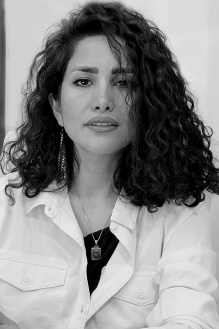
My name is Neda Abbasali Zadeh.
I’m a 33-year-old graphic designer.
I was born in Iran/Esfahan and live in Iran/Mashhad.
I pride myself on my eagerness and ability to learn. My longing desire to design stems from my affinity for order and geometry. Over the last few years, I have allowed myself to delve into design and art-centric lifestyle. Due to my attention to detail, I am constantly absorbing ideas from everyday life. I am very passionate about my work and driven to satisfy my clients.
I love having the opportunity to learn about what my clients are passionate about, and to help them visualize what they’d like to portray to their audiences. Not only are my clients diverse, but their projects are, as well. As an independent designer, I can take on projects of all kinds, which allows me to tap into all of the experience I’ve accrued through the years.
I specialize in design brochures, menus, business cards, editorial design for books and magazines, photography, posters, Ad advice, branding & identity design, interface design, printing, interior design, responsive websites, and applications—anything my clients need.
I've had the privilege to work with many high-profile clients, as well as new businesses and startups.
If you have a project that you'd like to work together on, please don't hesitate to get in touch.
If you have a project you would like to discuss, get in touch with me.
E-Mail : info@nedaabbasalizadeh.ir
E-Mail : neda.abbasalizadeh65@gmail.com
Company Website (Soner Graphic)